 |
| 'Modern Dilemma' in process by C.T. Rasmuss
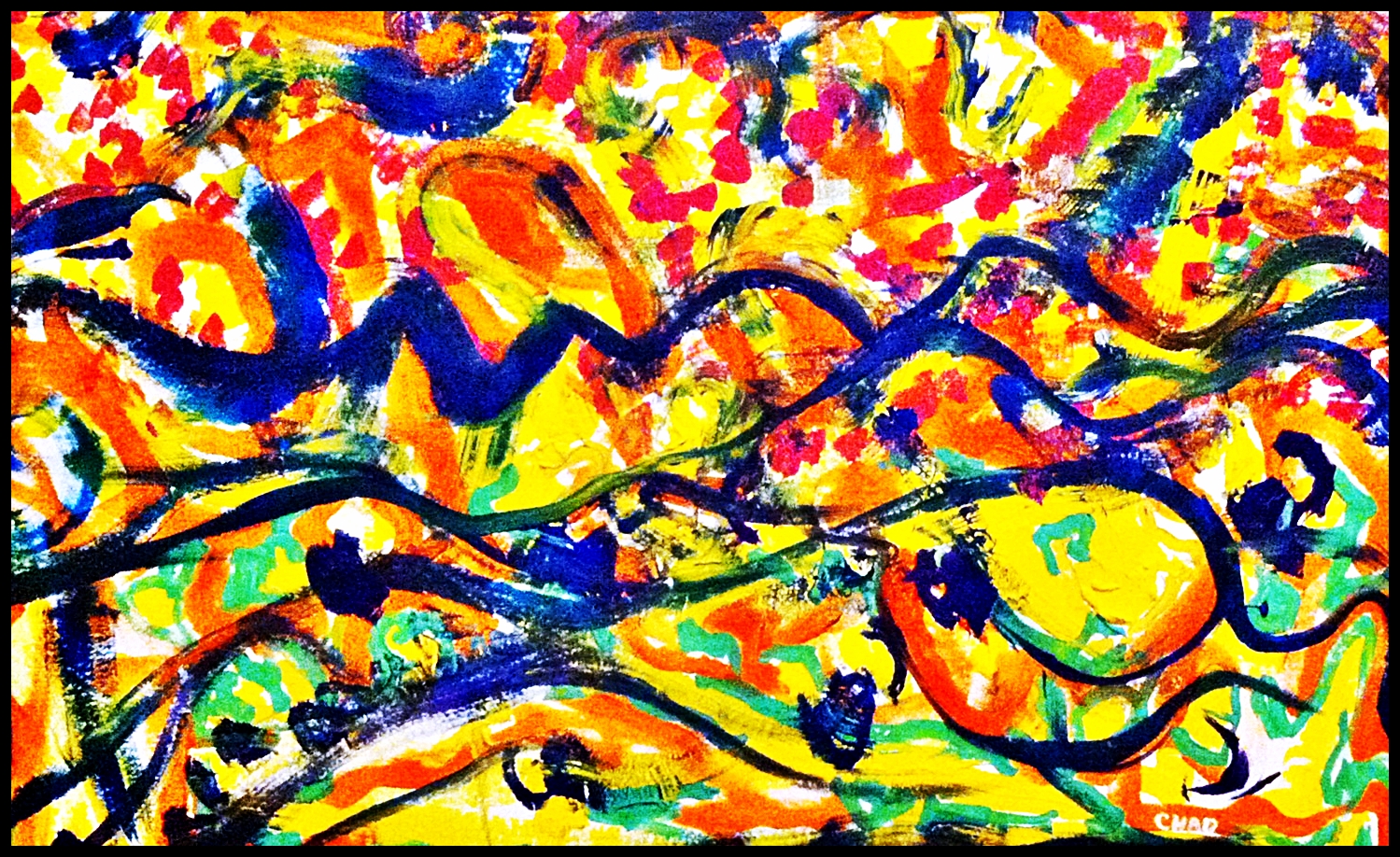
I'm not so sure as to what the actual "Dilemma" was in Stella's 'Jasper's Dilemma'; but I've come to realize, that I know in my current 'work in process-Modern Dilemma', that he may have been stuck by certain rules, he perhaps wouldn't allow himself to break(as I found myself).
Just a theory, but for instance if Stella pre-set rules such as: Dark Gray = Dark hue of Red & Light Gray = Light Red, Medium Gray = Medium Red, and so on for all other colors(3 primary/3 secondary). He then would have either started with either the Grisaille side or poly-chromatic side; with this set rule, and others alike, not to be broken. Given that he also finished one side 1st then the other(not working both sides simultaneously), as you can see that I have done in my Lucid Mosaic seen here, I started with Grisaille and finished to full completion, I'm currently working the poly-chromatic.^
Point being, after finishing my Grisaille side 1st, I then of course started with the corresponding right poly-chromatic side, but after trying to match up color with the gray-scale on the left, finished side, as Stella had done; I realized the "Dilemma": Quantitative -Grisaille vs. Qualitative color values, which I learned after reading more on Frank Stella, this was the case. But instead of fighting it and sticking to my guns, I am able to look into the past, and learn from these two masters of their craft, being, Jasper Johns and Frank Stella; I searched for a solution, and believe I have found one. The Solution?? Stay tuned to find out, as it is just theory now and may change;) Right now it's in Faith's hands.. |
Saturday, December 7, 2013
'Modern Dilemma' by C.T. Rasmuss, Continued.
Wednesday, November 6, 2013
'Jasper's Dilemma' Meet 'Modern Dilemma'- (Rasmuss' dilemma meet Japser's dilemma).
 |
| Modern Dilemma C.T. Rasmuss, oil (Nov. 2013). |
'Jasper's Dilemma' (1962-63) by Frank Stella, big whoop right?! but this happened to be a painting titled in respect to Jasper Johns, the artist that lead me to the purchase of this book; it also happens to be a very similar composition to my next mosaic I had planned.
Weeks ago, I had decided to do a geometric landscape, in respect to works I've been inspired via M.C. Escher. Then a week ago I thought of an "inventive" way to use my geometric composition: as a side by side perspective, involving a gray-scale mosaic next to the same picture, full of color.
 |
| Modern Dilemma C.T. Rasmuss, ink on paper (Oct. 2013). |
I thought it was a genius idea, and still do, but after seeing the existence of 'Jasper's Dilemma'; I realized it wasn't totally new in it's conception, specifically in being two identical geometrical images next to each other
:(
 |
| Jasper's Dilemma Frank Stella, Alkyd on canvas (1962-63). |
Doesn't mean I'm not seeing this through, as I am! I feel that it's just the blow to my ego for good measure & the fact "the show must go on". I also don't believe in unworthy coincidences, this perhaps is my dilemma; as I thought much of my geometric abstraction was completely new and inventive, before running into Stella haha..
One thing for certain is as far as I know, the only differing aspect of my work(in progress) is not just my mosaic method(inventive in it's own right) but that I chose my gray-scale to be on the left!..rather than the on the right!...as shown above^
Wednesday, September 4, 2013
Arshile Gorky; Helps Artist with Disillusionment.
 |
| Disillusion C.T. Rasmuss, oil (2013). |
This disillusionment of which I speak of, happens to stem from my current living situation; I moved into my new place with the 'disillusion', that it was going to be perfect...except I didn't count on one thing, a stubborn(drunken) Mule for a neighbor!!
Yet still.. I must keep things in perspective, as the good still outweighs the ugly!
This night in which I turned my despair into positive action, via Disillusion; I surely won the battle, not really against my enemy, but for myself...Soon as I sat down to recollect upon this vision embedded in my subconscious, the title came to me like a shot! It is what it is, and this very night, all I could relate to was Arshile Gorky's despair, and a painting of his that I could barely recall; a painting that's clear as day now after posting below..
 |
| 'Garden in Sochi' Arshile Gorky, oil (1943). |
A painting that affected me more than any other at the MOMA in NYC(as you can see the palettes are very similar, and was it somehow was my guide through this trying time last night:)
My Jungian analysis:
I see myself, atop right, lying down on my side resting with my hands behind my head(orange face, encircled in brown). I am watching a bird(right below facing to left, outlined in white) eating a seed(orange triangle, outlined in white w/ tip facing bird); just below the seed, a woman is lying flat on her back, arched upward starring at what I'm watching, with a snake slithering from the right side of the kidney shape she rest upon(as the snake intersects into her head).
 |
| Disillusion(middle section) C.T. Rasmuss, oil (2013). |
Quite ironic, as this is quite close to how I perceive my current living situation, surrounding bird feeders & Sunflowers outback, haha..just realized the title of Gorky's painting too, 'Garden"; a very crucial part of our feud, as he's mowed over my plants, weed whacked and killed them more ways than one, blah, blah, but I say thank you for the inspiration.
I must, or I lose- for my own sake!!!
Wednesday, August 28, 2013
Art About a Girl; Emi from Japan.
 |
| Juxtaposition of drawing by 'Emi' C.T. Rasmuss, Paintbrush software program (Aug. 2013). |
There Once was a girl I knew named Emi,
she came from Japan and into my hand;
We exchanged drawings in a cafe
called Art with Coffee.
I took her to the zoo, she liked the Lion,
as well as the Cheetah who was on break...
We ate expensive salads and had great conversation
I liked the birds, maybe she did too??
Emi received my gift at the end(a sketchbook)
with a pleasant smile, as she is very attractive;
"See you soon", she exclaimed!!
It's now been 4 weeks and I've yet the explanation..
..What 'soon' means in Japan.
But I figure now, that it might mean never...so it stands
Thanks for the drawing, Emi from Japan
enjoy your stay here, in my Homeland :/
Chad R.
 |
| Contour Drawing Emi, pencil (July 2013). |
"Sometimes, things just don't work out the way you might expect, but that doesn't mean you still can't extract inspiration from em."
Thursday, August 22, 2013
House Tree Person Test; Taken by C.T. Rasmuss
The House-Tree-Person test (HTP) is a projective test designed to measure aspects of a person’s personality.
Seen below, is a HTP I administered to myself without realizing it until the end, when it came into fruition:
This Work began purely as an Action painting, using India Ink on foam-core at "Last Day at The Pendleton-Cincinnati"; during which I was being interviewed on camera. I was actually working on three at the same time going back n forth from surface to surface; taking only one to full completion(that day), this not being the one. I told the interviewer that I would finish the other two at a later date, as it was just not meant to be for these two...and about 6 months later that 'day' had come for this particular one.
First, I discussed with myself: "Why does it need to be the same medium? I can just continue with oils(my re-current medium of choice), can't I?"
I then, mixed up a palette of oils & took to the palette knife! After 30 minutes of chaos and frustration I relaxed and took a quick breather, I then saw the perfect place for a house with a yard. I was reminded of my Graduate studies in Art Therapy at Hofstra out on Long Island & how I coincidentally administered a HTP- House Tree Person Test to my students(Seniors) in Assisted Living just the day before...
So here you have my H-T-P, question is what does it say about me, you be the judge, I still can't figure me out, haha!!!
Seen below, is a HTP I administered to myself without realizing it until the end, when it came into fruition:
 |
| HTP C.T. Rasmuss India Ink/oil on foam-core (2013). |
This Work began purely as an Action painting, using India Ink on foam-core at "Last Day at The Pendleton-Cincinnati"; during which I was being interviewed on camera. I was actually working on three at the same time going back n forth from surface to surface; taking only one to full completion(that day), this not being the one. I told the interviewer that I would finish the other two at a later date, as it was just not meant to be for these two...and about 6 months later that 'day' had come for this particular one.
First, I discussed with myself: "Why does it need to be the same medium? I can just continue with oils(my re-current medium of choice), can't I?"
I then, mixed up a palette of oils & took to the palette knife! After 30 minutes of chaos and frustration I relaxed and took a quick breather, I then saw the perfect place for a house with a yard. I was reminded of my Graduate studies in Art Therapy at Hofstra out on Long Island & how I coincidentally administered a HTP- House Tree Person Test to my students(Seniors) in Assisted Living just the day before...
So here you have my H-T-P, question is what does it say about me, you be the judge, I still can't figure me out, haha!!!
Wednesday, July 31, 2013
Matisse competing with Picasso inspires, 'Light Welcoming Shade' by C.T. Rasmuss, 100 years later.
 |
| Light Welcoming Shade C.T. Rasmuss, Oil (July 2013). |
Where do I start...
Well to be short, this one went through a few changes; if you care to know..it was supposed to be a mix between Picasso & Matisse's way of displaying a beautiful woman, with me being the deciding factor. And this is what you were supposed to see here; where I went wrong I believe, is in the fact that I haven't the luxury of a live model to work with...something I surely hope to remedy sooner than later!!
Also this is a 16"x20" canvas, whereas the masterworks I was modeling after, are much larger and practical for detail, specially when I used a palette knife, haha! I came up with my own composition of course & story-line, but when the woman turned into a blob; I turned the landscape into a pueblo like city-scape, and headed to the museum to sketch some Native American women.
..Oh yeah and the city-scape is formed after my memory of work by Georges Braque:
 |
| Viaduct at L' Estaque George Braque, oil (1908). |
 |
| Houses at L' Estaque George Braque, oil (1908). |
Again just another lesson on how to learn from the masters independently, and finding out where to go next possibly...what else is needed in my personal tool box of creativity.
Here are the two masterpieces referenced above:
 |
| The Italian Woman Henri Matisse, Oil (1916). |
 |
| Woman with A Fan Pablo Picasso, Oil (1908-9). |
Sunday, July 28, 2013
Joan Miro, The Naive
 |
| Ode to Miro, The Naive C.T. Rasmuss, oil (July 4, 2013). |
I recently came across an interesting art book titled, Naive Art by Nathalia Brodskaia; what caught my attention was the painting cover, Myself, Portrait Landscape by French Painter, Henri Rousseau. After finishing an exciting chapter I, it's my understanding that Rousseau's the 1st/main icon of Naive Art Movement.
 |
| Myself, Portrait Landscape Henri Rousseau, oil (1890). |
As I began to read chapter II, I was surprised to see it start with Miro as the focus, but I shouldn't really; given his style and goals in his art, "to assassinate painting", where he set out to create a new set of archetypes, etc. Here's where a definition of Naive Painting helps:
Naive Art-is a classification of art that is often characterized by a childlike simplicity in its subject matter and technique.
 |
| Femme III Joan Miro, oil (1965). |
If we replace 'childlike' with the widely accepted term, Atavism - the tendency to revert to ancestral type; we now include works even more familiar artists such as Picasso or Matisse, who were greatly influenced by African & Eastern artifacts/primal art, respectively.
 |
| Nude with Towel Pablo Picasso, oil (1907). |
 |
| Girl with Green Eyes Henri Matisse, oil (1908). |
Now back to Rousseau, who exhibited periodically with the Impressionists from 1884-1910, it made me think of Gauguin, then I thought of his statement: to Van Gogh: "try to capture your sunflowers by memory". Given the statement by Gauguin and Miro's work presented in my art book....I closed it and tried Atavism -
Miro style, but yes!! in my own language:)
Thursday, July 18, 2013
C.T. Rasmuss & DJEZUP present...the B-Side.
.JPG)
In the style of the famous Kandinsky, I flipped Paranoid Sunset(refer to previous post titled: C.T. Rasmuss & DJEZUP present) over and began on the other-side, ending up with Landscape of Confusion!
Here's the song list, again by color and in order of application:
1. Red- E.L.O., Ma Ma Ma Belle
2. Green- K.C. & The Sunshine Band, I'm Your Boogie Man
3. Blue- David Bowie, Space Oddity
4. Orange- The Lovin Spoonful, Summer in the City
5. Payne's Gray/Purple- Genesis, Land of Confusion
6. Yellow- T-Rex, Bang a Gong
7. White- Billy Joel, Only the Good Die Young
So there you have it, how the B-side is constructed, for further details, attend one of our events as they come up...we hope to put as much energy that you see here, as well as the energy fed from You, the audience!!
I will leave you with a little more on Kandinsky and his influence on the idea of the B-side, visually presented, other than the obvious Cassette/CD format of the past, which converges here and part of our process in mind.
Two Riders and Reclining Figure/Study for improvisation V (is, or are) the only known Kandinsky painting that was (or were) known to be painted on both sides. However, it was a common practice among hungry artists of early 1900s to paint on fiber board - on both sides, and then split them up and sell them as separate pieces. (Anonymous internet source).
click here to see the Paranoid Sunset blog, referenced above


Saturday, July 13, 2013
C.T. Rasmuss & DJEZUP Present..
So a buddy from way back & I are teamin up together at a venue coming near you, to bring you live music from DJEZUP, my buddy Wayne Lee Rogers; as I, C.T. Rasmuss paint what I hear. I have titled the piece above as Paranoid Sunset, it's the 1st experience(informal rehearsal) specifically geared toward our upcoming collaborative; I've performed many times via 'Live Action Painting', as he has Dj'd, but never together in this form.
Here is a List of the 5 colors I used in the artwork above and corresponding songs, in order of application:
1. Yellow-Nirvana, 'Drain You'
2. Orange-Rage Against the Machine, 'Take the Power Back'
3. Green-Incubus, 'Wish You Were Here'
4. Magenta-Beastie Boys 'You Gotta Fight'
5. Blue/Purple-RadioHead 'Paranoid Android'
It will be my 1st time performing to original music by an a musician, DJEZUP. Through this, as a painter I'll be able to focus more artistically and experiment with ideas of how music & painting are related, largely considering theory by Wasilly Kandinsky of course!
DJEZUP will be able to see what his music looks like, I hope, as well as the crowd that attends:)
Monday, July 8, 2013
'Struggle' Turns into 'Heavenly Dutch Windmill' by C.T. Rasmuss.

With this one, I started off with a blank canvas(of course), but the finished work shown here, is entirely different from what it was just the nite before last. I finished a painting that I wasn't sure about, if it was finished or a just complete mess. It was very dark & chaotic, and I saw it as a metaphor for my struggles, I mean clear as day; but it showed me winning in this struggle...I was 'stamping' out the enemy. And after a few days my victory was obvious and I was tired of looking at the ugly residue!!!

So I decided I was going to 'stamp' this image out of existence, for real..."I want Beauty", I thought to myself..."I don't need to be reminded of its ugliness, not in the least".
When I started out originally I had no idea what I was going to do, I was practicing a subconscious technique, which obviously worked, "but could it be done again? is this the final product or is there a second part to this interpretive metaphor?"; only one way to find out and I took the hard way out!
I recalled a student of mine asking me "do you ever paint off the top of your head?"; that day I answered with a quick painting(Top of the Floral), off the top of my head...and now this day I realized, after spending many more hours on 'Struggle' that The finished piece now known as 'Heavenly Dutch Windmill' is what was off the top of my head, the 1st ugly one is what got me there, a Metamorphosis if you will. I win!

Friday, July 5, 2013
Paul Gauguin's 'Still Life with Mandolin', 1885; featuring a remake by C.T. Rasmuss.
Opening statement from one of my art-books on Paul Gauguin:


"Gauguin has reworked the traditional still life and brought it up to date. He has retained a number of conventional ingredients-the rose...however he's not studied the different textures of the objects-the peonies are solid as the wood...The picture on the wall belonged to Gauguin(painted by his artist friend, Armand Guillaumin), similar to a view out of a window as in his own, 'Vase of Flowers', 1881."

Still Life with Mandolin, Paul Gauguin; oil (1885).
The following is my interpretation/Remake of the above accompanying statement/composition:

Remake of Gauguin's 'Still Life with Mandolin' (Lily); C.T. Rasmuss (CHAD), oil (2013).
I see now after looking at the table, that I have a larger angle sloping downward from the left, changing the space and composition via vanishing line. Where the vase sets, this vanishing line is briefly interrupted, here I'm reminded of Cezanne's still life's; where many of his lines were adjusted, sacrificed for the overall feeling of the work, which played a big role in Gauguin's work(and later the Modernists)..
From the beginning I set out to fill a space similar to Gauguin's original, which included color. I planned on leaving out the Mandolin & possibly the China bowl(another reference to Cezanne); due to my unfamiliarity with such iconic objects, as I've never had a use or interacted with either one. Once everything was in place, including place-mat(pun intended) & vase, I then started with the darkest leaves(undergrowth) continuing to use a brush, experimenting with technique; then I tried the peonies, but being unfamiliar with them up close, I had trouble to get them to work for me.
Solution:
I turned my attention to the opening statement above(from my art-book)...I said to myself: "This is not me" and reached for the palette knife, from then on I never left my array of knifes, end result:
Thinly brush on 1st layer over entire canvas, brush on texture and objects as far as the brushes will take you; when all else fails: "Pick up the palette knives..and don't look back"! In other words, study all you can and when you like something, don't copy it, but "make it your own", same as Gauguin had done over 100 years ago; hence my Lily instead of his Mandolin, I'm very familiar with Lilies:)
Tuesday, July 2, 2013
Van Gogh's 'Undergrowth with Two Figures', an Inspiring Work of Art.

I set this composition according to Van Gogh's 'Undergrowth with Two Figures' (June 1890), created in Auvers-sur-Oise, France.
I don't live in France and have never been, and I've never saw undergrowth such as in Van Gogh's painting...so when I was out on the Riverfront scouting for a good place to paint for the day, I was surprised to notice what was available to me on the Ohio River. I've studied this painting every time I go to the Cincinnati Art Museum..and I absolutely love it(featured below)..

My painting is a mix of an intriguing 'figure' (a brilliant white venue overhang) surrounded by 'undergrowth', I also replaced the trash cans with tall outdoor vases w/ flowers. My favorite part as well as in Van Gogh's masterpiece, is the large tree smack dab in the middle right of the work; I saw this in his as a broken rule and an obstacle he set to overcome..which I believe sets up the ultimate view of the two figures, and otherwise would be bland and ineffective if it weren't for the purposeful obstacle!
Enjoy!!!
Saturday, June 29, 2013
'Gone with the Wind' by C.T. Rasmuss.
 |
| Gone with the Wind; C.T. Rasmuss, oil (2013). |
"This one's for you Grams..."
A mix between viewing a Rothko exhibit in Columbus, OH and a particular Matisse at the Cincinnati Art Museum, I present you with this still life.
Beginning with Reds and Raw Umber, I pursued a color field technique, with Rothko in mind; especially when leaving outside borders for colors to be applied later-Green, Med.-Yellow, placed straight to a large brush(unmixed). Thinning out the remnant left on my brush, I ventured into the top portion, brushing this color out, leaving a 'pure' section for the still life. It's at this point when I was reminded of the Matisse at CAM (seen many times)....when it clicked I stopped!

'Portrait of Woman' Henri Matisse, oil (CAM)
After starting again, I brushed on Medium Blue til I ran out-leaving a pleasant surprise for latter in the middle border; I then added Prussian Blue to finish top and left outside border.
Upon finishing the still life, again with the Matisse in mind(w/ a minimalist brush style/pattern) I installed the vase. Here I created a deep blue base coat, and later added a lighter mixture of it to create highlight/texture, of course with impasto/Van Gogh tech. always in mind..here is where I started with the palette knife after failing with the brush & finishing the work's accents- for the complete and pleasantness that is.
Moral of story...Museums payoff, and I didn't have to even have them in front of me to influence my exploration on canvas...It's only out of respect if anything that we artist pay homage to the masters the best ways we can, and they will reward us beyond comprehension!
Thanks for all the faith Grams, miss ya!!
XOXOXO
Monday, May 20, 2013
Studying Cezanne - Going into the Past & Move Forward.
 |
| Mont Sainte-Victore from Les Lauves, Paul Cezanne, Oil on canvas (1904-06).
On occasion I've encountered works by early Impressionist, Paul Cezanne, like most people/artists what have you, whether in books or in person, even surfin the net...and always the same to me, blah whatever...somethin that irritates me, when I notice people doin the same to my work, a hypocrite I am..or was!!
Upon visiting The IMA in Indianapolis, IN, I encountered a landscape by Cezanne, and again blah oh well, "but there's gotta be somethin to it.." such a novice way to give this master audience, oh well! Then I noticed something, a short posthumous statement on the artist:
Somethin on the lines of ...'his late paintings, are works that the founders of abstract painting in the 20th century, continually refer to.' Which I later found in a book I purchased out of further curiosity. And boy has it paid off, above I included one of my favorite (later) works of his; and after studying him more in depth, I've come to realize:
"its the cross section of the past and the future, then and even now".
To me this particular painting/concept/execution represents a cornerstone, from which I'm sure to base much of my work on in the future, just like many artists before me have built much of their progress from foundations of his entire collection, this is my Plymouth Rock!!!
|
Wednesday, April 3, 2013
Ready for Spring??
I'm gettin ready for Spring in a big way this year, how bout You?
I've already found some blossoms making their way here, they tell me to get ready for some real inspiration this summer...to get out there and see what i can see and put it to the canvas.
Perfect timing cause I'm really into Flowers and landscapes right now, likr you I've been cooped up all winter, if we don't make the best of it, then the worse will creep its way in somehow, like a mold and devour what is not being used.
So gear up those of you from the Northern Hemisphere, Spring is here!!!
Thursday, March 21, 2013
'Mad Max City 1' by C.T. Rasmuss
 |
| Mad Max City 1 C.T. Rasmuss, Acrylic/Live Action Painting (2010).
When I first painted this artwork 3 years ago, it was untitled; then a few weeks ago I watched the movie Mad Max (Beyond Thunder Dome), starring Mel Gibson. I've watched the Mad Max series many times(3 all together), but what made this time different from all the others was the fact I finally noticed the film for what it was, fantastically 'Artistic'!!!
I tilted the painting above, Mad Max City 1 because it reminded me of the city described by the girl at the end...also my way of paying tribute, posthumously to a film trilogy, that I spent my childhood fascinated with.
I searched it out at and as far as I can see, it was not awarded any major awards for costume or set design; while watching the film I thought to myself this should have won something! How original and iconic it was, everything about it. Mad Max Furiosa is coming out this year, can't wait to see it, maybe this one will get it's just reward, and maybe even shed some light on it's Artistic values.
Art comes in many forms and inspiration comes from many sources, hence this film noir is suitable for any and all artists as far as I'm concerned.
|
Thursday, March 7, 2013
Georges Rouault: When Inspiration calls; Ride the Wave!


Upon visiting the Cincinnati Art Museum last Wednesday, I did a study of a Still Life by French Fauvist/Expressionist, Georges Rouault, cir. (1939). Every time I visit the local museum, I've been oddly attracted to his works, whether they were his Clown, figure of Christ or his Landscapes; this time putting my Ego aside, I read the accompanying information accompanying the Still Life and read how he applied his Stained glass background to his works; something in me went off like a light bulb!!!
Now I can't stop, and as you can see from a few of my latest works, which I've posted for you above; I realized that I ran into unexpected inspiration, and can't wait to visit it again tomorrow(as I plan on going to the museum tomorrow), Thank you Georges Rouault for the inspiration, wherever you are!!
"Surfs up"!!!
Wednesday, January 30, 2013
Son_Art_A Re-attempts "Art or Die III" Friday @ Midnight.
 |
| Art or Die I (2013). |
 |
| Art or Die II (2013). |
Son_Art_A Performs Re-attempts "Art or Die III" Friday @ Midnight...
When: This Friday Feb. 1st; 8th, 2013 @ Midnight.
Where: Hamilton/Fairfield Skate Park.
95 Joe Nuxhall Way Hamilton, OH 45015.
Located on south side of Forest Lake Lane, west of Nuxhall's driving range and east of Joyce park entrance..
See You there or be Square!!!
Later Skater!

Friday, January 25, 2013
Jim Morrison: "Something Sacred".
 |
| MLK Day 2013- 1, inverted (live performance) C.T. Rasmuss, India Ink (2013).
It is rumored that Jim Morrison of The Doors said once to a drinking buddy:
"...they want something sacred."
This was 1st brought to my attention in watching Oliver Stone's Movie on the 'Electric Poet', Jim Morrison and The Doors...whether fictional or not,as an artist I can totally relate to this comment. As I'm sure many others can as well, and its the reason for my blog today.
Today is my last day at Pendleton Arts Center-Cincinnati, because of this very concept!!!
It is in my opinion that the roof over 100's of artist's heads is only for the money; the people that own the lease and collect our rent, don't do it for the Arts(something sacred), but for the all mighty dollar alone(as far as I'm concerned ..again its my opinion based on a year's encounters, leading me to finally trust my first impression of this place-and places like this one all over the world for that matter.
I create because I want something sacred, and the best way I know how is through my artwork, I feel like a hypocrite when my work is headed in the opposite direction of the place in which I display it, therefore today is a great day!
I'm leaving this place in search of "something sacred"..
|
Wednesday, January 16, 2013
Son_Art_A Performs: 'Art or Die II' @ Midnight.
 |
| Art or Die I; India Ink, (Jan. 12 2013). |
Son_Art_A presents: 'Art or Die II', in commemoration of:
The Z-boys of the 70's, where in the mid-1970s, a major drought happened in Southern Cali that parched Los Angeles. The drought brought on severe water restrictions, forcing many pool owners in the well-to-do neighborhoods to leave their swimming pools drained. The Z-Boys saw opportunity, and moved right in. They'd drive through neighborhoods scouting for empty or semi-empty pools...these kids saw an opportunity and took their craft to the streets..
"Skate or Die"
-Pop.Calypse says: "Art or Die", whereas: Son_Art_A will 'scout' empty parking lots to paint and voice our rights to be alive!!!
Who: T_Paine will be performing 'Art or Die II' to the words spoken by, Red-Rodney (reading from 'Rights of Man'-Revisited Manifesto by Son_Art_A).
>-Rights of Man-Manifesto by Son_Art_A.<-
**Son_Art_A will announce place of debriefing afterwards, where Pop.Calypse will recite one of his poems (it will be a nearby place in which to warm up with some coffee).
When: This Friday, Janurary 18th @ Midnight.
Where: Boone County Skate Park in Florence, KY -
8100 Ewing Blvd. Florence, KY 41042. - click link below, for map:
->Map to Boone County Skate Park<-
 |
| X marks the spot! Come out and exercise your right to be free! The event at skate-park, will start promptly @ Midnight, and end A.S.A.P.; a rule of 15 minutes or less; so get there on time! It's "GooRilla Artfare"!!! not "Breakfast at Tiffanys" 
Original concept diagram for "Art or Die", India Ink.
|
Friday, January 11, 2013
I did it! (wrap up 2 of 4); 'Ode to Vincent Van Gogh' by C.T Rasmuss.


Well I made it! 105 paintings in 30 days!! Which ran from November 22nd @ midnight to December 21st @ midnight. This marks the first 'Ode to Vincent Van Gogh' 100 Paintings in 30 days...I have had quite a few artists respond to it, being that they would like to participate in the next one, or appreciated the notion; no matter the artist or type of artwork one does..Participation, in my opinion is a big part of the legacy Vincent had left behind( from his 37 years on Earth)...
I had done many drawings in this time frame as well as a few sculptures and what not, but being said, I count only 105 as they pertain to the original parameters(paintings in the truest sense); with only 2 more posts dedicated to this 'Artist Holiday' left, I plan on exhibiting a few more paintings and new parameters that I will apply to the next Artist Holiday.
For those of you that have followed this process with me in any degree, I appreciate your attention and appreciation for the legacy of Van Gogh as I wrap it up, putting it away til next time, Thank you and have a Creative 2013!!!
C.T. Rasmuss
Subscribe to:
Posts (Atom)