Monday, December 29, 2014

Madonna with Child; A Contemporary View of its Renaissance Form.

*to be titled at a later date*  C.T. Rasmuss, Marker layout for Lucid Mosaic (Dec. 2014).
Lately I've been studying the Renaissance, the most I have since my courses in art school; this is all due to coming across and watching: 'A History of European Art', lecture on DVD(The Great Courses) by Professor William Kloss.  


I've provided you with a link to it, as a resource which I keep renewing mine at the local library, from this course midway through the 48(30 min.) lectures, I've been inspired to finally attempt my rendition of Georges Rouault's, Madonna with Child(painted in 1920,but of a of a different name), which I saw and sketched quickly at the Dayton Art Institute, shown below:

Sketch of Rouault's Our Lady of the Fields C.T. Rasmuss
Even before visiting "The Dayton" my 1st time, I'd already been influenced and mesmerized by Rouault's stained glass quality to his oil work(as he served as a stained glass apprentice in his youth), I'd also become to admire his authentic texture, and especially his subject matter(uncharacteristic of his Modernist peers art work, for the most part) along with his extreme empathy for these subjects, almost to realized ecstasy.

Notre Dame des Champs NO. 4  Georges Rouault, oil (1920).
As you can see, I got the gist of Rouault's "Masterpiece", and last week when the spark hit me, I got the urge and grabbed the pre-fabricated canvas, and started drawing; from the very day I first saw, realized and sketched Rouault's "Madonna", I knew it was going to be one of my Lucid Mosaics, but I just didn't know when.  To be even more specific, it was going to and still is going to be my first Lucid Mosaic involving a composition, that deals with a portrait setting:

*to be titled at a later date*  C.T. Rasmuss, drawing (Dec. 2014).
I'm not sure if this was on purpose or not, as it can take a lifetime to understand the lifetime of the great masters, so I wouldn't put it past Rouault, as it was obvious through his unique Renaissance subjects, that he must not have only studied the great painters of the period, but also their inventions and hidden ideas that they introduced and perfected.  What I'm saying here is: in coming up with my own composition based from Rouault's, nearly 100 years earlier; I've noticed and capitalized upon an important central idea, found throughout much of Renaissance art, and that is the Trinity.

Trinity diagram   C.T. Rasmuss, ink.
In comparing my painting/drawing to the Rouault's original, the above Trinity triangle that I drew, overlaps our two paintings together by its central figures: Madonna and Christ child; with the top point rotating clockwise: 1. Mary's head, 2. Christ Child's head, and 3. is where they connect(Mary and Child).  

All in all, it was an innate need for me(capturing the essence of bond between these two figures above all other aspects), I feel lucky that I was able to carry this most important aspect(representation of the Trinity composition wise) over into my own interpretation of an artist's great & successful rendering of this heavily sought narrative; also with a similar need to communicate this age old subject, I feel blessed to have the faith in being able to just go for it.  Thereby receiving the reward of understanding, to which only this event could have given me!

To be continued..


Monday, December 22, 2014

Black Lightning by C.T. Rasmuss

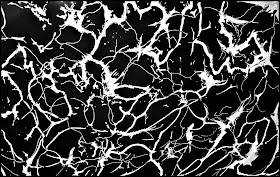
Black Lightening  C.T. Rasmuss (2013).

If you like the picture of mine above, I thank you, but I'm sad to say it doesn't exist anymore, but it still lives on throughout parts of my Lucid Mosaics, where it payed the ultimate price and has now disappeared into other artworks of mine.  The reason I'm presenting this to you, is for the same reason I took a picture of it in the 1st place; as I saw it as a work of art all in itself, by itself.

When it comes to other artists and my will to create a comrade-re between us artists, on similar missions, I'm all in and hold nothing back, but when it comes to this particular process of my own design(and of course the blessings of a higher design), I believe that I must keep some things to myself.  

My Exhibit at Broadhope Art Collective over the weekend  C.T. Rasmuss (Dec.19th 2014).
So anyway, I was talking to another artist yesterday by the name of Michelle Gravett, and she had mentioned some particular textures that I incorporated in my 'Provincial Orchard', specifically(shown: far, lower right) and because we have different perspectives of my work; me being the artist, and her being an observer, via our conversation I better understood how my "tiles" look to everyone else, and why I now wish to share one of my favorite whatchamacallits:)

She said: "the sky looked like stone", and we analyzed it a bit(so to speak), and is why I had to share it with you, whether an artist, an admirer or just someone curious about art; what I like about my favorite "whatchamacallit", is it's resemblance to Lightning, the natural aspect within a man made process by yours truly, and as we can only emulate life I say: "the truer the better", in this case for sure.


Monday, December 15, 2014

White Canvas, Frames on a Wall, and a Palette Caught in the Act.

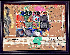
Palette Caught in the Act  C.t. Rasmuss, photograph with i-phone (Dec. 2014).

Last week, I was in the middle of painting some frames for an upcoming art exhibit of mine, which is now, this Friday; and as I was doing something with one of the more unfinished ones, I briefly glanced back over my shoulder, and this is sort of what I saw.  I didn't do anything to it(touch it or anything), I just left it as it was, and having the need to make this perception permanent, I did what any good photographer would do, I got my camera phone and took the shot.

And now I'm so glad I that I did!  I posted this photo on Facebook soon afterwards, and to a bigger reaction than anticipated, it got many likes, a share, and some commentary; so to sum it up: this photo was effective in making a point, but question is: "what that point(s) does it make"?  To answer: I'm not quite sure yet, but I think it goes deeper than first anticipated.  One of those shots I guess, that only comes from a mixture of intuition and the faith to take the shot!


When I was in art school down in Tampa, Florida(USF) about 5 years ago, I remember this girl in one of my conceptual art classes; we had our biggest assignment at the end of the year and remember putting lots of time into mine, as well as most other students in the class.  The reason I remembered this girl and the only reason she stood out was cause for her art assignment she had just placed a regular frame on a wall and that was her project, many of us all just looked at each other in disproving reactions mostly; as we all felt that she was grasping at straws, as the rest of us had put real thought  into our work and most of us took it seriously.  
This also reminded me of the 1st time I'd seen the White canvases on the top floor of the MoMA, when I attended Hofstra, a few years before USF; and I can't help but think that my photo is a result of all these factors.  The two photos above are obviously pictures of frames, meant for their original purpose(top photo), and for interior design(bottom photo)and not in the name of Fine Art in my opinion.  

*

*I'm unable to cite these two works of art, as the sites I'd gotten them from, hadn't cited them either*

 *

Once in one of my sculpture classes at USF, I "accidentally" spent many hours on a White canvas of my own, which started out as a gigantic hard surface canvas for sculptural purposes, but ended up as a "White canvas" for my final critique(one in which my professor said was better than most graduate exit critiques). 'Palette Caught in the Act' raises at least two questions: "Is the White canvas, Fine Art?" and "Is a frame on a wall or around a palette, Fine Art?"; my answer to both of these is: "depends on the context they're in..".  As an example, based on my answer, the first two photos, again are not Fine art...but the second two are!  

The second grouping fits the category of Fine art because: the top photo is a frame that is deconstructed, then reconstructed into a completely different composition, where the artist seems to be trying to make an artistic statement; and the bottom photo is more obvious, as its actually in a Gallery, where it still can be disputed, but that's a different argument.  

As for my photo, I will defend my increasing like for it, by stating that: it's an original concept as far as I'm aware of, I meant to make an artistic statement by taking the photo(a composition that no longer exists within 10 minutes of "taking the shot", as the frame is now in use and the palette is back to being just a palette), which defines my statement: The Metaphysical Argument.  What that is specifically, we may never know for sure, but it's why I took the shot; our need to explore further into the void..

White Canvas 2  Robert Rauschenberg

Shown above is Rauschenberg, sitting in front of one of his White canvases, I can't recall who the 5 or 6 artists at the MoMA were, but this one was brought to my attention by my artist friend John Sousa.


Monday, December 8, 2014

Mazement: Finding the Cheese Again.

Mazement   C.t.Rasmuss, oil (2014).

I can't remember the mood I was in when I set out to paint the above oil abstract, that I finished a few weeks ago, but I can say that the drawing on the canvas about a month before and it just sat there ever since.  Since then I'd been like a deer in headlights, and every time my eyes were cast upon it, it reminded me more and more of my laziness, frustration, vexation, annoyance, or being stumped(perhaps all of them at one point) and this is all I can remember and why I chose this particular painting today.

Because this is also how I feel today, not 'Mazement' as in amazed, but just the opposite: suck in a maze, today I contemplated earlier, hear at a place I frequent for coffee and WIFI, and where I show some of my work; where I picked up four of my artworks today from November's show, as soon as I saw the two large ones leaning on one another face to face(the smaller two in the same fashion I later found), I was instantly offended, I felt immediately that the person in charge of this: 1, has no idea what they're doing and either 2 has no real regard for the art-work.

No matter the actual truth behind it, I got a feeling that my art-work(style) was probably completely misunderstood in such a place, and therefore: I drew a quick conclusion that perhaps it has no home hear or anywhere really; so now I contemplate: "Should it Matter?"(there's a good chance that I could be mis-reading the entire situation); but at least I know I could never twist my talent and make work just to sell - this is entirely out of the question to fix this problem, and as a result I'm faced head on with: the difficult choice to continue on with no promise, nor any clear direction, into the Abyss I feel...lol!

Some days this journey is "on hold", some days I jump in face first, some days it just happens natural, and some days, like over this weekend, it beat me up pretty good, so the question is: What kind of mouse will I be today in this Maze?;  I'd say the same goes for all of us, so...how bout you?..what will you get done today?  As for me, tho minimal, I've at least gotten started...gotten over that hump or around that 1st turn, and hopefully I just might find the cheese again, even if its just for today, F it!!!


Friday, December 5, 2014

Paul Signac and I, Brothers in Art.

Remake of Signac's: Pont des les Arts 1928 by C.t.Rasmuss, pencil/gouache (Nov. 2014).


I just over heard a brief conversation between an artist and the manager of a local place that holds exhibits, where I'm at for the WIFI and coffee, in order to make this post, and right as I was placing the above image: Remake of Signac's Pont de les Arts 1928, by yours truly...I heard the artist contemplating out-loud to his manager, about a current process for his new piece he's working on.  What got to me was his resolution in this conversation, this being the essence and conclusion he'd drawn from their encounter, which was: "...depends on what people want to put in their homes..".

Wow!!!  This comes as a shock to me and at the same time as a revelation: people/fellow artists, are 'we' this shallow?  To compromise everything we do, and are, what we represent, just to please others, merely for the chance they might give us a bit of cash?  If so, then what's it all for?  I mean, it embarrasses me to ever think ourselves to be in the same category as those great innovators of the Renaissance, especially those who painted without a license, risking their lives to express their freedoms and beliefs, as well as many other generations of artists, fighting a cause, big or small.  Hearing an "artist" talk the way this artist did just now, really offends me; and opens my eyes even more to a generation filled with others that feel this same way, paint this way, and base their life's work on(excuse me but) such a slutty principal!

Now don't get me wrong, if this is a hobby for you, or your painting for a loved one/friend/family member, etc. and you're keeping in mind what they'd like, etc. I respect you for it, but when money's involved; other than even perhaps a much needed commission for professionals, this doesn't include my contempt, but I would like to say even to these commercial artists and commissioned pieces: they too should have a certain freedom from outside influence, in sake of truth, over money, but that's just me(hopefully til the grave).

Thumbnail of S's: Pont des les Arts 1928 by C.t.Rasmuss, ink (Nov. 2014).

People!  I swear to you, I was here at this same place last week for the same purpose and read a coffee-table book: 'Master Drawings Rediscovered' by Ilatovskya; The State Hermitage Museum, St Petersburg/Abrams.  and in this book I saw many drawings and watercolors by Signac, more in one book than I'd ever seen before; I've known about his pointillism long before his drawings, which most people know him for of the former; so upon seeing this: I was inspired to finally make attempt of my own, not because it: "...depends on what people want to put in their homes.", but because, coincidentally I'd been in search of a composition by this same Master for my next Lucid Mosaic, I did it entirely for myself.

Drawing for Remake of Signac's Pont des les Arts 1928  by C.t.Rasmuss, pencil (Nov. 2014).

The Mosaic's I do are especially for me, my belief in God's gift he's revealed to me, and I believe all of this to be true because it's our collective duty to push beauty further(or point out where we fall short maybe, being the other-side of the spectrum), among others.  And if none of it ever gets it due, well then that's not my problem.  "I tried my best", which is what I hope I can restfully say someday, old and gray.

So the compositional source I used for my Remake by Signac, had a bridge, something I hope someday to incorporate into one of my mosaics, as they evolve in complexity; for now it's just nice having an excuse to paint a bridge anyway, the bonus here is using my innate gouache style, which you'll see is why I feel such a strong attraction to Signac's drawings.

Palette in the Dessert  C.t.Rasmuss, ink/gouache (2010).

The above painting is a landscape straight from my imagination, and done before ever seeing Signac's unique style in watercolor/gouache, making us brothers in art some how:) 

Bank of the Seine Near the Point des Arts with a View of The Louvre  Paul Signac, pencil/watercolor/gouache.

Pont des les Arts  Paul Signac, oil (1928).

The 1st of these two paintings by Signac, is one of the drawings from the book I mentioned, and the second is the oil painting that I drew the actual remake from; this oil of his seems to me more of an example of: Post-Impressionism than his Pointillism, which he famously helped develop after the death of his mentor, Georges Seraut.

>Follow this link to view more drawings by Paul Signac<

Saturday, November 29, 2014

Rockwell Kent's Adirondack Landscape 1940; Under The Giving Sun in 2013.

Under The Giving Sun  C.t.Rasmuss, lucid mosaic (2013).

Rockwell Kent's: 'Adirondack Landscape from 1940; I first came across this painting last year at The Dayton Art Institute(and a few weeks ago I was able to re-visit and take the photo this time); I'd heard of Rockwell Kent before, but just his name, not much more than that, but when I came upon this painting, instantly I had to draw it! As I quickly sketched it, as usual, with any other work of art, I started to learn more about it's composition, simple as it may have seemed; as it was just a landscape with trees, a sky, and clouds. Even so, I became more and more interested in the unique styling of these common, compositional elements; which later without foresight, became the focus of a 200-150 hour labor intensive lucid mosaic.

Adirondack Landscape  Rockwell Kent, oil (1940).
 These compositional elements which I'm referring to the: trees, shrubs and clouds(which I did not end up including in the final artwork) caught my eye and gave me the idea to turn this composition into my next lucid mosaic. The trees, which were my favorite part overall, are how they seem realistic, but have exaggerated openings allowing the landscape to pierce through; this shape-like characteristic allows for unique and organic objects possible, to be included in one of my mosaics; this goes for the shrubs as well(and clouds if I'd included them).

Three Hills  C.t.Rasmuss, lucid mosaic (2012).
 When it came to the clouds, I had changed my mind near the end, they just didn't seem to be enough anymore, so I replaced them with a “majestic” sunrise & sun-rays, for an “East meets West” touch. I believe the need for this change was caused from the extra row of trees/shrubs I place on the secondary wave of landscape; I did this to create and existential component, as I believe Kent's original had a touch of it, and as an artist in the 21st century it's my duty to try and improve on any work, or movement by the master's.

Click here to learn more on artist: Rockwell Kent

Original sketch at Dayton Art Institute by C.T.Rasmuss, ink (2013).


Friday, November 21, 2014

To Paint or Not to Paint..Ecstasy of St. Francis at Dayton Art Institute Leads to Crossroad.

To Paint or not to Paint  CHAD, oil (2013) Artist's private collection.

This painting, I rendered from a sketch that I did as I saw a kid getting out of school, he was admiring a small grouping of wild flowers, that seemed to be growing out of place as far as I was concerned; I was stopped in traffic on a two lane road at the time.  Once I noticed the kid in this tiny "field" of wildflowers, it struck me as odd, because it was  in the middle of the city and this kid seemed intensely drawn in, without care to anyone, or anything around him in this busy, bustling of our everyday city life; so I quickly grabbed my handy sketch book and did what I could, as something told me not to let this moment go.

I'd been struggling to come up with ideas or the energy to paint at this time, and it took many months til I actually revisited this sketch, if not a year, and when I finally did, it was my first return to oils in almost 5 years.  I believe my first true experience in art, was in oils, where I felt I could do anything that the best artists of the past could do; I was able to relate this kid's experience with the wildflowers (a rare action in my opinion, especially for this absurdly, modern world) and translated  it to my canvas!

The buildings in this painting were my favorite part, as I couldn't recall them from memory, or sketch their accuracy fast enough that day in traffic; my main objective was to make the buildings in a way that they were completely inanimate to create a space that was imposing yet powerless against the object of focus, a way of portraying how buildings seem to have more importance in the developed world than individuals and their interaction with nature; I also made the person(best to my ability) allowable for anyone to claim it's identity.

The sketch happened in 2012, painting in 2013, and here now in November of 2014, I've for the 1st time studied in depth, Italian Painter, Giorgio De Chirico, considered to be the greatest Italian painter of the 20th Century, founder of the Metaphysical movement and the main influence & contributor to the Surrealist movement that followed in the mid to late 1920's, here's an example of a favorite of mine, 'The Great Metaphysician':

The Great Metaphysician  Giorgio De Chirico, oil (1917) The MoMA.

His faceless characters and Neo-Ferarra architectural set the stage for a space that he can easy manipulate for scale & effect, for me it also has shed new light on a oil painting I did over a year ago, a painting that's been in the back of my mind ever since; I always thought it wasn't finished and now realize somehow, that it is, it's just not a finished idea, but the beginning of something special I think.


Kenneth Branagh as Hamlet; "Gravedigger Scene"

Selections from Hamlet: Modern Translation; written by Shakespeare (1599-1602).
Act V scene i

Gravedigger Here’s the water, right? And here’s a man, okay? If the man goes into the water and drowns   himself, he’s the one doing it, like it or not. But if the water comes to him and drowns him, then he doesn’t drown himself. Therefore, he who is innocent of his own death does not shorten his own life.

...later in scene after Hamlet and Horatio enter the graveyard in which Ophelia's to be buried..

Hamlet That skull had a tongue in it once and could sing. That jackass is throwing it around as if it belonged to Cain, who did the first murder! It might be the skull of a politician once capable of talking his way around God, right? And now this idiot is pulling rank on him.

Mel Gibson as Hamlet; "Gravedigger Scene".


You might be asking yourself what does Hamlet and these selection from the play have to do with De Chirico and my painting?. and I too was, until just now when upon blind faith I've realized: "the skull", why it may be so "Iconic" to many people, especially in Hamlet, out of all the symbols, from one of the greatest plays in Theatre?

Despite being part part 1/2 Irish, 1/2 Danish decent, my last name being Danish: Rasmussen, Son of Erasmuss; before knowing this fact, I've been attracted to the story of Hamlet most of my life, whether its through watching the play, a movie, artwork(Van Gogh's Skull of Skeleton with Burning Cigarette, Seen below), reciting Hamlet's most famous soliloquy in college as a theatre major, or studying Tom Stoppard's adaptation: Rosencrantz and Guildenstern.  

And now I realize how Hamlet himself relates to the ambiguity of the skull's identity, in perhaps my favorite scene; as it was once alive, a skull that we all have in common, of course among other things we have anatomically in common, but directly linked to identity in this case more so than any other "bone" in the body.  This relationship between Hamlet's interaction with the skull that the gravedigger digs up, has led me to the ambiguity of identity throughout De Chirico's masterworks, and also my: 'To Paint or not To Paint', as I've now finally come to title it.


Upon visiting the Dayton Art Institute, which sparked this entire assemblage, I drew a detail, sketch from Italian Renaissance painter, Bernardo Strozzi's 'St. Francis in Ecstasy':

Ecstasy of St. Francis  Bernardo Strozzi, oil (1615-18) Dayton Art Institute.


Detail of Strozzi's "Ecstasy of St. Francis" (Nov. 2014).

What I really like to point out in this detail is the comparison to De Chirico's 'The Great Metaphysician', how the pedestal, vertical style is where I see and evident crossroad; which will be clearer for me after, perhaps what I'm able to derive artistically from this, as De Chirico had a respect for the Classicist painters and the Masters as so do I, of course we differ in many other ways, but this is just a momentary crossing, then for me to go on my own way.

So when I go to the museums I usually sketch everything in its entirety, the best I can, rarely do I just focus on a detail, and usually its floral patterns or detail work; in this case I drew the detail in a way that, would make Cezanne proud as I sacrificed its actual composition for what I actually see, which really wasn't there(or was it?).  While drawing this, I was inspired in the oddest way, and couldn't figure out what to do with the detail, and still can't really, but I believe whatever and whenever I'm inspired to take this further, it is a crossroad, and that crossroad for me just might be the Skull..?..as Strozzi did over 40 paintings on the subject of his muse: St. Francis.


Saint Francis' religious life reminds me a lot of Van Gogh's painterly life, separated by 700 years, I'm sure Vincent was aware of St. Francis and his sacrificial life style, which may have influenced him along his desperate journey to get closer to God in his own way.

Skull of a Skeleton with Burning Cigarette  Vincent Van Gogh, oil (1886) Van Gogh Museum.

 Ever since seeing Van Gogh's Skull with Cigarette above, upon seeing it for the first time, even 2nd and third, I couldn't believe that anyone had ever done such a thing over 100 years ago, let alone 50, I've been fascinated with this "surreal" image that was way ahead of its time, especially when you think of how people never knew smoking was bad for you lol!

Pyramid of Skulls  Paul Cezanne, oil (1901) Private Collection.

And last but not least, today is the 2nd time coming upon this work by Cezanne, it's a prominent work, and out of all artists I'm glad it's Cezanne because of his ingenuity reassures me, that I'm at the right crossroads; fingers crossed...x.x..


Friday, October 31, 2014

COLLECTIVISM: A Movement of the Here and Now; Powered by The Collectivism Coalition.

Collectivism-  A collective way for artists to discover their creativity, together. This artistic movement in the infancy of the 21st century, looks to bring a taste of the early Modern Art Masters, into the here and now....We are looking for artists who have been influenced by Modern Art from the 1900s to present day..
         -Paulo Guimaraes(co-founder)


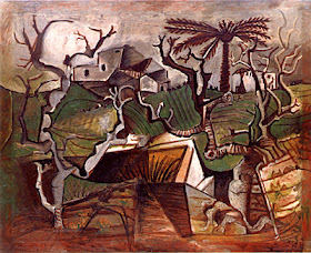
Winter Landscape  Pablo Picasso, oil (1950).

Tulips and Oysters  Henri Matisse, oil (1943)

The paintings are from two of the best known Modernists in the 20th century, Pablo Picasso and Henri Matisse; I posted artwork by them to demonstrate how much of this new movement we hope to inject into today's "loose" art world, will likely revolve around them(or similar artists) directly or indirectly somehow.

These particular two artworks are also famous for being part of many trades between the artists(the same open relationship encouraged under Collectivism), according to Picasso, his 'Winter Landscape' may have been Matisse's muse for the chasubles in his Venice Chapel; and Picasso chose Matisse's 'Tulips with Oysters' because: "he didn't understand it".

This relationship between the two Masters highlights what Collectivism is all about, it's a movement that doesn't revolve around today's mentality of pure individualism nor the attitude instilled into art students that: "every other artist is your competition"; but that without other artists, there is no art, so why not take advantage of possible relationships with other artists, especially with the Masters who've left their mark for a reason!

Collectivism is not naive in saying that everyone be "buddy buddy", but that we admit our differences, put them out into the open(w/o fear), and not to be afraid of criticism or a little friendly competition, to adopt a mentality of: "that which doesn't kill you makes you stronger", we believe that the art-world of today simply needs a little(lot) more togetherness, revisit the past & push each other toward the future.

For more interesting reading on the relationship between these two Modern masters, I have provided a link below:


Friday, October 17, 2014

Vincent Van Gogh; Letters to Emile Bernard, and Now a Lucid Mosaic by C.T.Rasmuss.


Upon reading the first few letters of Vincent Van Gogh to his artist friend, Emile Bernard; I couldn't help, but admire one of his sketches that he sent to Emile, in letter III.  The book also included accompaniment of the final painting, in which I only saw in black n white, til now(on purpose, as I hoped to capture as much color correctness through his words only).

Shown above is my Lucid Mosaic, a technique all of my own invention(to my knowledge), and below is the original(in oil) by Van Gogh himself, done in Arles, early April 1888:


And this is the sketch he included in his letter to Emile:


In these two(B/W) renderings of Van Gogh's 'A Provencal Orchard', I was immediately stricken by the intersection of the horizontal garden path(both ends hidden by the fence), and the diagonal "main" path running down and to the right corner(placing the viewer left of this path w/o mistake of their orientation to the entrance of the Orchard), a perfect composition in my mind!

And I was inspired to prove how strong this composition is, I believe it may be an overlooked piece and doesn't have the panache of his more famous iconic ones, but deserves just as much attention, mostly due to its teaching aspects and composition values.

I mainly wanted to give a somewhat ordinary(at first) artwork of his: a "new life", and this actually has opened the door for me to do the same for many other pieces; after succeeding in this attempt, I feel like I can take my technique and give new life to, other Old Masters not so famous artworks, within their oeuvre.  Not that they really need it, but I would like to give attention to, perhaps what the critics, art lovers and contemporary artists may have over looked.

Going back to the process for execution of the mosaic(after deciding what my new mission was, or is becoming), I drew a quick sketch from Van Gogh's painting, followed by an actually thumbnail.  This allowed me to transform his original painting into a template, for the purpose of my technique; and my favorite part of this particular experience vs. previous pieces I've done, was that this was the first time I concentrated on the actual brushwork, I was able to because of the way Van Gogh worked his canvases with heavy impasto.


I've also included the part which he explains the Orchard to Emile if you'd like a sample for yourself:

"Here, by the way, is a sketch, the entrance to a Provencal orchard with its yellow fence, its screen of black cypresses(against the mistral), its characteristic vegetables of varying greens...the whole of the sky has a bluish hue and the greens are either definitely blue-greens or yellow-greens, purposely exaggerating in this case the yellow or blue qualities."

And that is that, and there you have it...and now on to the next one, So...there is a Signac I saw yesterday, and after sketching it I suddenly lost my will, but a few pages later I really got excited again especially after sketching it twice, so who knows..


Friday, October 10, 2014

What's in The MoMA? Artist - Paulo Guimaraes Gets Inspired (Part 2 of 2).

 Crucifixion (Corpus Hypercubus)  Salvador Dali, oil (1954).
For us artists some times the answer to the question, "What's in the MoMA?" when asking the regular public, would most likely be, "just a bunch of stuff that makes no sense"; and this type of response would of course offend most of us.  But what right do we have to be offended by such an attitude from the public, if we ourselves do nothing to defend the nobility of such important establishments?!

As I'd mentioned in part one of Paulo's visit to the MoMA, he became heavily inspired, and now has a series started, totaling 4 pieces; he's actually exhibiting these pieces in NYC:


posted above is Dali's vision of Christ, and it happens to be the inspiration for Paulo's final piece of his 4 piece series, he told me that he recalled it from when was still in school; and just for the record, this is not in the MoMA,but actually in the MET, which just so happens to be around the corner, so your in luck Paulo Guimaraes in being reunited with your muse!!

I remember seeing my 1st Dali and it was at the MoMA, and I saw a lot of artists here for the first time, and some for the "plentieth" time; as always it's a great feeling to see masterpieces that you've never saw, but can see work you've done in them.  And then there are works that you wish to aspire to, followed by the ones you'll only ever be able to admire(I feel that by admitting this last one, only means that there's no reason for me personally to figure it out artistically, leaving the magic of it untouched & forever pure).

As you can see from Paulo's final artwork(of 4) below: there's a good resemblance to Dali's masterwork, with much added character and uniqueness to it, staying in line with the rest of Paulo's series as a whole; and in viewing his series as a whole, there definitely an evident signature, so much so, that the words which come to my mind are: "Cubist-indigenous Americana"(perhaps a dawning of movement parallel to the original Cubist movement, where African artifacts inspired Picasso, not my call however-artist freedom, a beautiful thing we must agree:):
>click here to view (part 1) & Paulo's 1st two artworks of series<

Cubist Christ  Paulo Guimaraes, oil 24 x 36 (2014).

The whole: "copying", which I, as you might already know refer to as "Remake" of the masters always resurrects a great argument between most all artists; of all genres and philosophies; whether academically trained to the max or 100% self taught(independent)..."When is a painting truly a one of a kind?' this eventually leads us to another world, too large to discuss here and now. What's important for now is: just because you visit a museum for inspiration, view art books, take part in collectives or learn from your contemporaries of the world...what matters most is:

      That you stay true to yourself, never stop learning from the library amassed by the great artist before you, and give credit when credit is due.  Because how else is the generation after us to learn about their craft and their surroundings(artist/non-artist) and to truly make the best of it!

And again to be great is to be part of the great circle that continues to grow, and the only way to be part of it: is to wholly infuse yourself into it with everything you got, and as Dali once said:

“Begin by learning to draw and paint like the old masters. After that, you can do as you like; everyone will respect you.” 
                                ― Salvador Dalí

Friday, October 3, 2014

James McNeill Whistler: Adaptation of an Radical Artist's Template (Part 2 of 2).

Display of artwork by C.T. Rasmuss, artists studio space (2010).
 Dear Redtree Gallery,

"My name is C.T. Rasmuss and I'm an artist who wishes to display his artwork at your fine establishment.  And I'm quite sure if given the opportunity, that I have enough artwork to fill the entire space of your gallery; even if hung semi-Salon Style; as I would also be including my best and latest work.  The title for this show that I'm presenting to you is: Open to The Public, as this cycles around the main concept that I have in mind for the purpose of this exhibition; My goal follows in the steps of 19th century artist and founder of "art for arts sake", James Mcneill Whistler.

As I wish to present my art to the public in a new, inventive and revolutionary way, as I believe he was bringing the art-world into the revolutionary 20th Century, I to wish to be on the fore front of bringing it into the 21st century, a century heavily fueled by heavy advances in social media.

The main statement revolves around my Blog, which I've been maintaining since 2010, I have over 200 posts on art topics and art I've done, concentrating mostly on the paintings/sculpture I've produced, steps taken, processes, influences, etc.  My purpose in maintaining this blog has been to keep a log for myself as well as  inform the "public", on a world they might not be familiar with, because the way I see it; what good is it if the people your doing it for has no real means to understand what is being presented in front of them?.

In being part of many shows in the past or just as a guest to exhibits, whether they be in Manhattan or here in the Midwest, the atmosphere seems to be dominated by appetizers, wine and small talk, which I have no problem with, but artistically speaking: my will is for the people to be more engaged with the art, which experience shows that when this actually happens, it makes the wine and cheese taste much better, which also makes a happier gallery, because their patrons/guests are naturally taken over by the art; which is a big reason for my motivation as an artist, we all want something to talk about(in this case it's art) so leave what's outside the gallery, outside and: "take a load off".

So to you, I'm including a brief detail of what I'm suggesting, curatorial-wise:  I will include a wide variety of works, price-wise, style, size, medium, etc. they will fill the space aesthetically to the dimensions of space, with a mix between salon style and "white cube" hanging.  The main theme, is my Blog, where rather than the normal: title, price, medium simple label or even a brief description; I will be including an actual(uniform through the space) printout from my blog, including photos, sketches, pretty much however the blog appears, some will be cutoff because of the uniform approach...being that its a blog this will give the viewer the opportunity to gain further info. at their discretion if they so chose, also during the opening, the public has more information on the artwork that speaks to them(as many museums today use headphones), and therefore a way to generate conversation: "art for art's sake" between the artist, patrons and gallery.

Harmony in Blue and Gold: The Peacock Room  James McNeill Whistler, oil & gold leaf on canvas, leather & wood.
Now for the above image, known as Whistler's 'Harmony in Blue and Gold: The Peacock Room'; it was painted between 1876-77 and is considered to be one of the greatest surviving aesthetic interiors, the most marvelous example of the aesthetic movement interior decoration, and part of the Aestheticism movement in which the battle cry was: “art for art's sake”, whose works are sometimes described as “autotelic” from the Greek autoteles, “complete in itself”; which backs up my goal of establishing the importance of each piece in the exhibition as an individual evoking person-ability between the painting and viewer(interaction with information on each piece via my blog and other accompanying visuals), encouraging the intimacy fine art deserves.

This was a statement piece then and remains unchallenged today, aesthetically speaking, this is also just one aspect of a truly multi-dimensional artist who was widely known throughout the art-world as an expatriate artist, writer, performer and self publicist, among other things like part-time gunrunner.  These are all great or interesting attributes, but I'm most interested in: "His purposeful use of past art and his awareness of the collapse of private & public spaces..." - James Mcneill Whistler; uneasy pieces by David Park Curry

“From the invention of the picture gallery in the early Renaissance until the last quarter of the nineteenth century, paintings were generally displayed salon style...frames touched frames, leaving no room for labels”(as well as no room for due individuality);as I've already briefly mentioned, example shown below:


"...Whistler's work as an exhibition designer played a crucial role in development of modern styles of displaying art...He controlled every aspect of his installations...he designed distinctive designs for pictures and made sure the baseboards and crown moldings were colored to harmonize with the fabrics he used to cover the walls. He even designed color-coordinated uniforms for the guards. Whistler's installations were unlike anything contemporary art lovers had ever seen, and his exhibitions were widely discussed happenings.”
-Mr. Whistler's Gallery; The Art of Displaying Art – Magazine Antiques;Nov. 2003 vol.164 issue 5, p142; Myers, Kenneth John.

The Artist's Studio  James McNeill Whistler, oil (1865).
His contributions as well as other artists of the aestheticism movement, lead way to the presentations we see today: “the white cube” which by 1960's completely replaced the outdated, salon style of the past.  Again my hopes are that all my future exhibitions from here on out will follow in the footsteps of a master, “a master of breaking the mold”, as you'll see by showing up to one of my next exhibitions:)

example of a modern day "white cube" exhibition
I feel now is the time for a neo-renaissance starting with the weakest link, the connection between the artist, viewer and artwork itself; somewhat like the dark ages so long ago, but that's another story..

Follow this link to view part 1 of this 2 part series.


Friday, September 26, 2014

Remakes vs. Reproductions and Why it Matters; with Paintings by Rasmuss & Guimaraes.

Remake of Rouault's: Flowers in a Yellow Vase 1939  C.T. Rasmuss, acrylic (2014).

Flowers in a Yellow Vase 1939   Georges Rouault, oil.
     
For the last few years I've been focusing a lot of my effort on studying the masters, comprising mostly of the Impressionists like Cezanne and Manet; Post Impressionists: Gauguin and Van Gogh; Modernists: Matisse, Derain, Braque, Mondrian, and as you see above, Georges Rouault; Surrealists: Miro, Chagall and Dali; Abstract Expressionists: Pollock, Rothko and Mark Toby; as well as countless other artists and their respective movements, too many to mention.

As a result of studying these artists, I've been inspired 10 fold; as to opposed to if I had never picked up a book based on them, their work or, especially seeing it in person.  Every time I paint, I understand that: no artist especially, can claim to be 100% autonomous in their efforts, no matter how hard they try, so I say why not just embrace it and use it to our advantage, the way I believe it was intended; just like the masters before us payed homage to those before them: how these greats admit truth and thereby profit from those compounded truths.

Remake: Alexej Von Jawlensky's Portrait of Alexander Sakharoff 1909  Paulo Guimaraes (2014).

Alexej Von Jawlensky's Portrait of Alexander Sakharoff 1909, oil.

Below is a statement by friend and artist Paulo Guimaraes, who inspired this post and the need for such a post.  He's the creator of the Jawlensky Remake above, which I personally prefer to the original; this makes total sense if you think about it, given that Paulo is a more than capable artist who claims to be still learning, but this is how all the masters felt if you asked them especially even in their later years, also his painting is more up to date, as I will give you an example of what I mean, after Paulo's statement on this pressing issue in today's art-world:

Paulo Guimaraes: The 21st century has been a time of technological advances in medicine, computers, cellphones, and even in the Art world. Much of the art I see through online gallery websites, have been created by digital means or are paintings “perfect” in execution, they follow the style of old masters such as Da Vinci, Michelangelo, or Rodin. This perfection is as pretty as a photograph. However, it was not long ago that photographs replaced these same realistic works of art; inviting a new bread of artist to take over, radical in thought, action, and execution.

These such artists were Picasso, Matisse, Duchamp, Pollock, Dali, Miro, and so on; these artists changed the face of art in the way, that anything could be considered art. And I am one who agrees with this with all my heart, I feel the art world of today needs to re-focus on the Masters of Abstract expressionism, Surrealism, Dadaism, Automatism, etc. the movements their artwork and accompanying doctrines helped establish - The rebel 'isms' of the art world.


Lately I've been on a mission to remake some artworks by these rebellious artists, as an homage to their greatness and will to step outside the box, for the sake of all of us. It seems to me that today's art loving public want something exactly like the original as reproductions/prints. But to me, this is a disservice to the Masters of the strange exciting and originality! To pay true homage to the arts, we must embrace their work and then make it our own, add our own flavor to the mix and bring new life into the old!! Join me and artists like C.T. Rasmuss, as we witness the Phoenix come alive once again!!

Self Portrait & Vesuvius Man Leonardo Da Vinci, drawings (1490).

Ceiling of Sistine Chapel  Michelangelo, fresco (1508-12).

The two photos above, are perfect examples of realism and the exactness(what Paulo was referring to) in standards of painting set by Leonardo Davinci's iconic, Vetruvian Man, such exactness acclaimed in the Michelangelo's painting of The Sistine Chapel.  Then in the mid-19th century a shift started to happen, a split actually, right around the time of the invention of the photograph, eventually(as Paulo pointed out) for many artists there was no longer the need for accuracy, because the photograph could do it better(exactness of Vetruvian Man) and thanks to photographers like Alfred Stieglitz and and Ansel Adams at the turn of the century, they started to infiltrate the art world and give the camera legitimacy.

                                                    Georgia Okeefe Hands 1919, Alfred Stieglitz.                         


                                                              Church & Abandoned Automobile Ansel Adams 1957.

So today, you can do a remake or reproduction of the above two photos or any painting you like really, but the difference is, a remake is to: make(something) again or differently and reproduction is the: action or process of making a copy of something.

So there you have it, so when an artist sets out to paint a "remake", with an intent to learn through another artist, such as one of the Masters of the past he is not copying something, but indeed doing a remake with an intent to create something anew! To bring it into the future perhaps, I think it's very important for artists today to make this distinction, because Isle 7 of your nearest Walmart is full of reproductions, and as artists is up to you and I to do what we can to help tear down isle 7 with all our will, and thereby creating and obsolescence for such TRASH(reproductions)..

And when I mean Trash I'm talking about poster reproductions of: Starry Night, Escher's Night and Day, The Mona Lisa, etc. even those more expensive canvas prints, and especially cheap reproductions of mediocre contemporary art; all for the sole purpose of "makin a quick buck"!  Original art is vital to the art movement and a strong culture, and remakes are an integral part of it, as opposed to the damage caused by a multitude of mere reproductions.

Here's one of my favorite examples of an (extreme) remake; which there are many throughout art history, you just need to find them, and I truly hope you to  introduce even more great art:

The Luncheon on The Grass  Edouard Manet, oil (1862-63).

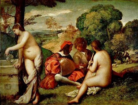
The Pastoral Concert  Giorgione or Titian, oil (ca. 1510).
 Manet's inspiration for his: The Luncheon on the Grass was The Pastoral Concert, painted back in the time of the Renaissance and something even more interesting has just come to my attention; thanks to this inquiry I was able to discover the following information on Picasso's homage to Manet's single masterpiece(a great artwork I've been intrigued with ever since art school) I found it on the MoMA's website:

"The painting 
Luncheon on the Grass by Édouard Manet was the starting point for an extensive series by Picasso, including twenty–seven paintings, one hundred and fifty drawings, eighteen maquettes, and five prints."
link to: MoMA article.


Picasso remake: Edouard Manet's The Luncheon on the Grass.
                             
                                Picasso remake: Edouard Manet's The Luncheon on the Grass.

So I leave you with this in mind, even the greatest of artists such as Picasso, really all of them, "pay homage" to the greats before them, so why not us, I feel the art-world has tried to turn its back on its past for too long, which has created a weakness in this once grandiose field, much like music has turned to POP rubbish, we believe it's time for a Neo-Renaissance, and this is a good example of how to start defining that movement.

Remake of Modigliani's: Madame Survage by Paulo Guimaraes.

Madame Survage  Modigliani, oil.

We can only get better as a whole, and that takes guts!!!