 |
| Some Men C.T. Rasmuss, mixed media/juxtaposed-grayscale (2013).
Some Men
Taming
doubt and mastering grand
illusions
of the impossible,
do
these factor in Mr. Keats;
into
your theorem of consolation?
“Beauty
is truth, truth beauty”!
Some
men need to know more.
Exploring
an inexhaustible system of caverns
masked
with lavish odors of tasty Mint Julip:
streams
of relevant hopes cascade along,
emptying
waste and spoils into an epicenter
of
shipwrecked faith and smashed dreams.
Some
men unfortunately drift out to sea.
Chronicles
of captain's bliss, read softly aloud
upon
vast lands of turmoil and vengeance;
all
the while, its impressionable audience being
captured
by sidewinder speeches, hissed by
forked
tongues wrapped in corrupted silhouette.
Some
men find themselves stranded ashore.
In
the wake of God's infinite brilliance
it
is beckoned to us all that:
“Men
shalt not live by bread alone...”
Perhaps
because in a muffled den of thieves,
virtuous
men would drop like flies!
Signal...Some
men pray on their knees.
Endearing
temptations to reach something greater:
souls
of isolation steer clear into magnanimous wake.
Relentless
subordination to fierce elements and tide,
the
artist, records his findings with a naive brush;
attained
destination is relevant, given with each stroke.
Some
men go on, continue bailing out their boats.
Basking
in a hypnotic Amber light, graciously cast
by
smoldering embers, crackling, becoming internalized:
ashes
continue piling into the outstretched urn of time.
Flickering
from petrified dreams of youth, mortality gains
acceptance
from its morality, with fully glazed eyes;
Some men wade in a pool of eternity. |
Monday, February 24, 2014
Some Men: A Poem by C.T.Rasmuss.
Friday, February 7, 2014
Jackson Pollock: A Methodical Madman or Just A Madman?
 |
| She's Beautiful C.T.Rasmuss, The Jackson Method (Feb. 2014). |
Jackson Pollock seems to be a recurring theme for me, ever since I started devoting most of my efforts toward painting back in 2005, when was still living in my hometown, Flint, Michigan. I took courses in painting at The University of Michigan-Flint; but largely I was self taught, 'Independent' as I prefer to be known, as some of the greats before me; I say "the greats before me" because like Pollock and other great artists, it's in 'our' blood to out do our predecessor's...
In my case I not only wish this, but I also wish to prove the critics against Pollock, wrong, that he wasn't a Madman, but in fact there was method to his madness; as I hope you can see in this post. I aim to continue in this manner of documenting, as I dig deeper into this debate; what I like to call the: The Jackson Method, capturing the evidence w/o compromising the integrity of autonomy.
p.s. I hope to me joined by other professionals of my field as well as other fields that can help explain the implications and dynamism of The Jackson Method.
Stage1:
Stage2:

Stage3:

Stage4 w/thumbnail:


Sunday, February 2, 2014
John Keats: Is This the Truth and Beauty you Imagined? A poem b y C.T.Rasmuss
 |
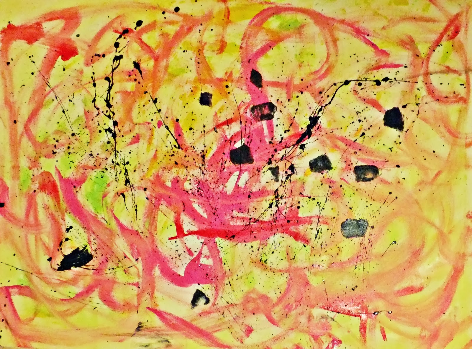
| Some Men C.T. Rasmuss, India Ink/acrylic/pastels (2013).
First and foremost I'm an artist, and as an artist I give myself the freedom to express my intentions any which way I please!
Lately I've been working on a series which has nothing to do with which I wish to express via this 'blog'...what is..relevant is the poem which I've been working on, a poem which is intended for a local poetry contest.
You see...writing/poetry is my White Whale, so I've devised a plan to pursue this eluded art-form as well as apply my strengths as a visual artist into another field; a sort of self satisfying experiment if you will, or more like a form of self validation as well as spiritual release, But as always I give my utmost attention to truth, beauty and Humanity(with God's blessing of course).
Some Men (1st rough draft)
Taming Doubt and Mastering
Illusions of the Impossible,
Is this part of the truth and beauty
we need to know of, Mr. Keats?
In the wake of God's infinite Brilliance;
it is told to us, "Men shall not
live by bread alone, but..."
perhaps in a world of thieves,
virtuous men would drop like flies!
Some men still pray on their knees.
The Chronicles of Bliss softly read
upon the lands of turmoil;
while it's impressionable audience
is captivated by speeches
of those corrupted silhouettes.
Some men are bailing out their boats.
Endearing to reach something greater
souls of isolation in magnanimous quake,
subordination to the fiercest elements,
an artist records his findings with a brush
attained destination is relevant with every stroke
Some men are stranded ashore.
In a system of bountiful caverns
masked with a lavish odor of Mint Julep
streams of irrelevant hope cascades along,
emptying its spoils into the epicenter of
smashed dreams and crushed faith.
Some men drift out to sea
In light of smoldering embers of mortality
flickering from petrified dreams of youth;
|
Friday, January 10, 2014
Meet 'Night & Day - A Modern Dilemma' Everyone!!
 |
| Night & Day - A Modern Dilemma C.T. Rasmuss - A technique invented by the artist. (2013-14). |
Success
at last!! To spare you the details, and redundancy: I simply
accomplished what I set out to do and more!...
I
100% believe that this is a solid artwork in everyway, and like all art, it
can be built upon; but what I'm most satisfied here with is: I took a
chance, a risk, a BiG! risk! - Considering this work took me around
225 hours or more to complete, even after its original conception, and
corresponding sketches.
It opened my eyes to see how Art can be separated in another way:
Art that is & art that BECAME...
Below
you'll notice two masterpieces created by two masters of the arts, that
have paved the way for artists such as me; my Above art-piece is an
amalgamation of my own artist intuition, direction given by the
masterpieces below, and the will to discover the unknown.

Day & Night M.C. Escher - woodcut (1938).

Jasper's Dilemma Frank Stella - alkyd on canvas (1962-63).
Link: Jasper's Dilemma meets Modern Dilemma blog post
Oh yeah and please let me know what you think, please leave your comments - join my blog if you'd like !! I want to hear from you, Thank you!!!
Oh yeah and please let me know what you think, please leave your comments - join my blog if you'd like !! I want to hear from you, Thank you!!!
Saturday, December 7, 2013
'Modern Dilemma' by C.T. Rasmuss, Continued.
 |
| 'Modern Dilemma' in process by C.T. Rasmuss
I'm not so sure as to what the actual "Dilemma" was in Stella's 'Jasper's Dilemma'; but I've come to realize, that I know in my current 'work in process-Modern Dilemma', that he may have been stuck by certain rules, he perhaps wouldn't allow himself to break(as I found myself).
Just a theory, but for instance if Stella pre-set rules such as: Dark Gray = Dark hue of Red & Light Gray = Light Red, Medium Gray = Medium Red, and so on for all other colors(3 primary/3 secondary). He then would have either started with either the Grisaille side or poly-chromatic side; with this set rule, and others alike, not to be broken. Given that he also finished one side 1st then the other(not working both sides simultaneously), as you can see that I have done in my Lucid Mosaic seen here, I started with Grisaille and finished to full completion, I'm currently working the poly-chromatic.^
Point being, after finishing my Grisaille side 1st, I then of course started with the corresponding right poly-chromatic side, but after trying to match up color with the gray-scale on the left, finished side, as Stella had done; I realized the "Dilemma": Quantitative -Grisaille vs. Qualitative color values, which I learned after reading more on Frank Stella, this was the case. But instead of fighting it and sticking to my guns, I am able to look into the past, and learn from these two masters of their craft, being, Jasper Johns and Frank Stella; I searched for a solution, and believe I have found one. The Solution?? Stay tuned to find out, as it is just theory now and may change;) Right now it's in Faith's hands.. |
Wednesday, November 6, 2013
'Jasper's Dilemma' Meet 'Modern Dilemma'- (Rasmuss' dilemma meet Japser's dilemma).
 |
| Modern Dilemma C.T. Rasmuss, oil (Nov. 2013). |
'Jasper's Dilemma' (1962-63) by Frank Stella, big whoop right?! but this happened to be a painting titled in respect to Jasper Johns, the artist that lead me to the purchase of this book; it also happens to be a very similar composition to my next mosaic I had planned.
Weeks ago, I had decided to do a geometric landscape, in respect to works I've been inspired via M.C. Escher. Then a week ago I thought of an "inventive" way to use my geometric composition: as a side by side perspective, involving a gray-scale mosaic next to the same picture, full of color.
 |
| Modern Dilemma C.T. Rasmuss, ink on paper (Oct. 2013). |
I thought it was a genius idea, and still do, but after seeing the existence of 'Jasper's Dilemma'; I realized it wasn't totally new in it's conception, specifically in being two identical geometrical images next to each other
:(
 |
| Jasper's Dilemma Frank Stella, Alkyd on canvas (1962-63). |
Doesn't mean I'm not seeing this through, as I am! I feel that it's just the blow to my ego for good measure & the fact "the show must go on". I also don't believe in unworthy coincidences, this perhaps is my dilemma; as I thought much of my geometric abstraction was completely new and inventive, before running into Stella haha..
One thing for certain is as far as I know, the only differing aspect of my work(in progress) is not just my mosaic method(inventive in it's own right) but that I chose my gray-scale to be on the left!..rather than the on the right!...as shown above^
Wednesday, September 4, 2013
Arshile Gorky; Helps Artist with Disillusionment.
 |
| Disillusion C.T. Rasmuss, oil (2013). |
This disillusionment of which I speak of, happens to stem from my current living situation; I moved into my new place with the 'disillusion', that it was going to be perfect...except I didn't count on one thing, a stubborn(drunken) Mule for a neighbor!!
Yet still.. I must keep things in perspective, as the good still outweighs the ugly!
This night in which I turned my despair into positive action, via Disillusion; I surely won the battle, not really against my enemy, but for myself...Soon as I sat down to recollect upon this vision embedded in my subconscious, the title came to me like a shot! It is what it is, and this very night, all I could relate to was Arshile Gorky's despair, and a painting of his that I could barely recall; a painting that's clear as day now after posting below..
 |
| 'Garden in Sochi' Arshile Gorky, oil (1943). |
A painting that affected me more than any other at the MOMA in NYC(as you can see the palettes are very similar, and was it somehow was my guide through this trying time last night:)
My Jungian analysis:
I see myself, atop right, lying down on my side resting with my hands behind my head(orange face, encircled in brown). I am watching a bird(right below facing to left, outlined in white) eating a seed(orange triangle, outlined in white w/ tip facing bird); just below the seed, a woman is lying flat on her back, arched upward starring at what I'm watching, with a snake slithering from the right side of the kidney shape she rest upon(as the snake intersects into her head).
 |
| Disillusion(middle section) C.T. Rasmuss, oil (2013). |
Quite ironic, as this is quite close to how I perceive my current living situation, surrounding bird feeders & Sunflowers outback, haha..just realized the title of Gorky's painting too, 'Garden"; a very crucial part of our feud, as he's mowed over my plants, weed whacked and killed them more ways than one, blah, blah, but I say thank you for the inspiration.
I must, or I lose- for my own sake!!!
Wednesday, August 28, 2013
Art About a Girl; Emi from Japan.
 |
| Juxtaposition of drawing by 'Emi' C.T. Rasmuss, Paintbrush software program (Aug. 2013). |
There Once was a girl I knew named Emi,
she came from Japan and into my hand;
We exchanged drawings in a cafe
called Art with Coffee.
I took her to the zoo, she liked the Lion,
as well as the Cheetah who was on break...
We ate expensive salads and had great conversation
I liked the birds, maybe she did too??
Emi received my gift at the end(a sketchbook)
with a pleasant smile, as she is very attractive;
"See you soon", she exclaimed!!
It's now been 4 weeks and I've yet the explanation..
..What 'soon' means in Japan.
But I figure now, that it might mean never...so it stands
Thanks for the drawing, Emi from Japan
enjoy your stay here, in my Homeland :/
Chad R.
 |
| Contour Drawing Emi, pencil (July 2013). |
"Sometimes, things just don't work out the way you might expect, but that doesn't mean you still can't extract inspiration from em."
Thursday, August 22, 2013
House Tree Person Test; Taken by C.T. Rasmuss
The House-Tree-Person test (HTP) is a projective test designed to measure aspects of a person’s personality.
Seen below, is a HTP I administered to myself without realizing it until the end, when it came into fruition:
This Work began purely as an Action painting, using India Ink on foam-core at "Last Day at The Pendleton-Cincinnati"; during which I was being interviewed on camera. I was actually working on three at the same time going back n forth from surface to surface; taking only one to full completion(that day), this not being the one. I told the interviewer that I would finish the other two at a later date, as it was just not meant to be for these two...and about 6 months later that 'day' had come for this particular one.
First, I discussed with myself: "Why does it need to be the same medium? I can just continue with oils(my re-current medium of choice), can't I?"
I then, mixed up a palette of oils & took to the palette knife! After 30 minutes of chaos and frustration I relaxed and took a quick breather, I then saw the perfect place for a house with a yard. I was reminded of my Graduate studies in Art Therapy at Hofstra out on Long Island & how I coincidentally administered a HTP- House Tree Person Test to my students(Seniors) in Assisted Living just the day before...
So here you have my H-T-P, question is what does it say about me, you be the judge, I still can't figure me out, haha!!!
Seen below, is a HTP I administered to myself without realizing it until the end, when it came into fruition:
 |
| HTP C.T. Rasmuss India Ink/oil on foam-core (2013). |
This Work began purely as an Action painting, using India Ink on foam-core at "Last Day at The Pendleton-Cincinnati"; during which I was being interviewed on camera. I was actually working on three at the same time going back n forth from surface to surface; taking only one to full completion(that day), this not being the one. I told the interviewer that I would finish the other two at a later date, as it was just not meant to be for these two...and about 6 months later that 'day' had come for this particular one.
First, I discussed with myself: "Why does it need to be the same medium? I can just continue with oils(my re-current medium of choice), can't I?"
I then, mixed up a palette of oils & took to the palette knife! After 30 minutes of chaos and frustration I relaxed and took a quick breather, I then saw the perfect place for a house with a yard. I was reminded of my Graduate studies in Art Therapy at Hofstra out on Long Island & how I coincidentally administered a HTP- House Tree Person Test to my students(Seniors) in Assisted Living just the day before...
So here you have my H-T-P, question is what does it say about me, you be the judge, I still can't figure me out, haha!!!
Wednesday, July 31, 2013
Matisse competing with Picasso inspires, 'Light Welcoming Shade' by C.T. Rasmuss, 100 years later.
 |
| Light Welcoming Shade C.T. Rasmuss, Oil (July 2013). |
Where do I start...
Well to be short, this one went through a few changes; if you care to know..it was supposed to be a mix between Picasso & Matisse's way of displaying a beautiful woman, with me being the deciding factor. And this is what you were supposed to see here; where I went wrong I believe, is in the fact that I haven't the luxury of a live model to work with...something I surely hope to remedy sooner than later!!
Also this is a 16"x20" canvas, whereas the masterworks I was modeling after, are much larger and practical for detail, specially when I used a palette knife, haha! I came up with my own composition of course & story-line, but when the woman turned into a blob; I turned the landscape into a pueblo like city-scape, and headed to the museum to sketch some Native American women.
..Oh yeah and the city-scape is formed after my memory of work by Georges Braque:
 |
| Viaduct at L' Estaque George Braque, oil (1908). |
 |
| Houses at L' Estaque George Braque, oil (1908). |
Again just another lesson on how to learn from the masters independently, and finding out where to go next possibly...what else is needed in my personal tool box of creativity.
Here are the two masterpieces referenced above:
 |
| The Italian Woman Henri Matisse, Oil (1916). |
 |
| Woman with A Fan Pablo Picasso, Oil (1908-9). |
Sunday, July 28, 2013
Joan Miro, The Naive
 |
| Ode to Miro, The Naive C.T. Rasmuss, oil (July 4, 2013). |
I recently came across an interesting art book titled, Naive Art by Nathalia Brodskaia; what caught my attention was the painting cover, Myself, Portrait Landscape by French Painter, Henri Rousseau. After finishing an exciting chapter I, it's my understanding that Rousseau's the 1st/main icon of Naive Art Movement.
 |
| Myself, Portrait Landscape Henri Rousseau, oil (1890). |
As I began to read chapter II, I was surprised to see it start with Miro as the focus, but I shouldn't really; given his style and goals in his art, "to assassinate painting", where he set out to create a new set of archetypes, etc. Here's where a definition of Naive Painting helps:
Naive Art-is a classification of art that is often characterized by a childlike simplicity in its subject matter and technique.
 |
| Femme III Joan Miro, oil (1965). |
If we replace 'childlike' with the widely accepted term, Atavism - the tendency to revert to ancestral type; we now include works even more familiar artists such as Picasso or Matisse, who were greatly influenced by African & Eastern artifacts/primal art, respectively.
 |
| Nude with Towel Pablo Picasso, oil (1907). |
 |
| Girl with Green Eyes Henri Matisse, oil (1908). |
Now back to Rousseau, who exhibited periodically with the Impressionists from 1884-1910, it made me think of Gauguin, then I thought of his statement: to Van Gogh: "try to capture your sunflowers by memory". Given the statement by Gauguin and Miro's work presented in my art book....I closed it and tried Atavism -
Miro style, but yes!! in my own language:)
Thursday, July 18, 2013
C.T. Rasmuss & DJEZUP present...the B-Side.
.JPG)
In the style of the famous Kandinsky, I flipped Paranoid Sunset(refer to previous post titled: C.T. Rasmuss & DJEZUP present) over and began on the other-side, ending up with Landscape of Confusion!
Here's the song list, again by color and in order of application:
1. Red- E.L.O., Ma Ma Ma Belle
2. Green- K.C. & The Sunshine Band, I'm Your Boogie Man
3. Blue- David Bowie, Space Oddity
4. Orange- The Lovin Spoonful, Summer in the City
5. Payne's Gray/Purple- Genesis, Land of Confusion
6. Yellow- T-Rex, Bang a Gong
7. White- Billy Joel, Only the Good Die Young
So there you have it, how the B-side is constructed, for further details, attend one of our events as they come up...we hope to put as much energy that you see here, as well as the energy fed from You, the audience!!
I will leave you with a little more on Kandinsky and his influence on the idea of the B-side, visually presented, other than the obvious Cassette/CD format of the past, which converges here and part of our process in mind.
Two Riders and Reclining Figure/Study for improvisation V (is, or are) the only known Kandinsky painting that was (or were) known to be painted on both sides. However, it was a common practice among hungry artists of early 1900s to paint on fiber board - on both sides, and then split them up and sell them as separate pieces. (Anonymous internet source).
click here to see the Paranoid Sunset blog, referenced above


Subscribe to:
Posts (Atom)